Today we look at a map of the United States.
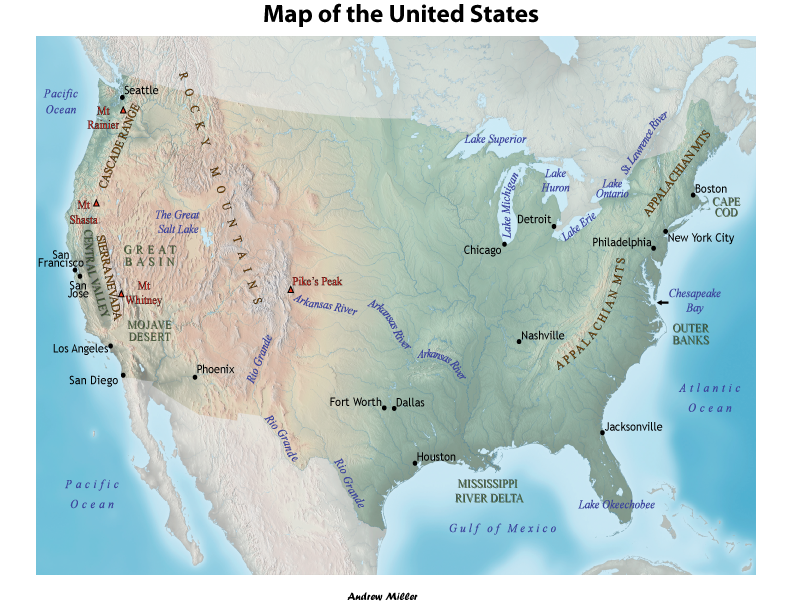
All of the text I placed here. I used the serif font, Times New Roman for natural features and the sans serif font, Trebuchet MS for political features (in this case just city names).
Map-making takes a lot of compromise. “San Francisco” in particular is in a less than ideal position for a city name. But I had to squeeze it in next to “San Jose” and “Central Valley”. Another difficult one was “Mt Rainier”. The text crosses the boundary between land and sea, which is usually best avoided. However, there were limited options in how to fit it next to “Cascade Range” and “Seattle”. But the most important thing with “Mt Rainier” is that text is clearly tied to the symbol. To make the connection clearer I made the symbols for peaks the same colors (for stroke and fill) as I did the text.
In order to fit the text “Mt Shasta” on the map without it crossing into the ocean I decided to abbreviate it. I then decided to keep the names of mountain peaks consistent and abbreviate all of them. I found that to fit the “Appalachian Mountains” also required abbreviation, but consistency was not realistic for labeling the mountain ranges given how short “Rocky Mts” is. I decided not to include punctuation in the abbreviations since that could be mistaken for symbols. The period in “St. Lawrence River” on the other hand does not present this problem because it is within a single line.
The arrow next to “Chesapeake Bay” is called a “callout”. You want to avoid using those if at all possible. However I could not put “Chesapeake Bay” over the bay without obscuring it, and there are other inlets lower along the map that could’ve been mistaken for it without the callout.
The texture of the terrain sometimes made contrast difficult. For better contrast thin stroke lines were applied to the outlines of text for the “Mountain Ranges” and to “Mountain Peaks”. Given the similarity in color for “Central Valley” to its surroundings I decided this was not enough to create sufficient contrast for its category “Other Physical Features” (the green text features) and so used a “drop shadow” effect from “Stylize” under “Effects” for all of the text in this category.
I hope you enjoyed looking at this map and learning a little bit about map-making.
