For those readers confused about the title Lab # 1 was constructing the blog in the first place.
For this lab (Lab #2) I investigated Adobe Illustrator, learning about its various tools, and I have two images to show you.
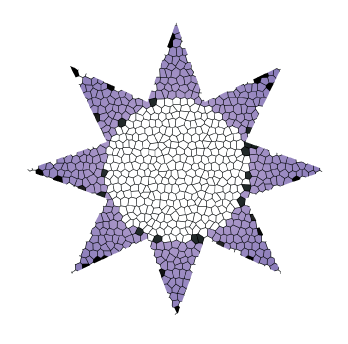
Stained Glass Star
The star was created using Adobe Illustrator. A white circle was placed inside a purple 8-pointed star, and then they were grouped together by selecting them both and clicking the “Object” menu at the top and then clicking “Group” (You may also use Ctrl+G). Then under the “Effect” window under “Texture” I selected “Stained Glass” and after adjusting “cell size”, “border thickness”, and “light intensity” got this amazing star.
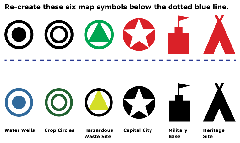
For the above image the original had only those pictures on the top. I made new pictures but with different colors, and gave each of them plausible labels as to what the bottom symbols could mean on a map.
To explain my choice of color for the first one, blue goes well with “Water Wells”. No pun intended. Though it makes intuitive sense it could be an issue if any of the wells are too close to rivers or bodies of water, although that could be remedied by making those a much lighter shade of blue.
It makes intuitive sense to make crop circles green, since crops are plants and plants are associated with “green”, hence the use of a green circle. The color “green” may also appeal to the audience’s ideas about who may have made the circles. This would go best placed on farmland represented as a light brown. The darker shade of the crop circle symbol would allow colorblind readers to still read the map.
Yellow triangles are often used as warning signs, so a map could use a yellow triangle in a yellow circle to represent a “Hazardous Waste Site”. The outer ring is black to make it easier to spot.
I went with black to represent a “Capital City”. This color is often used on political maps. Black is a particularly good choice if the map contains roads and the roads are in red.
A map displaying “Military Bases” would probably have terrain on it, and black would be a good noticeable color in contrast with green and brown colors for terrain, gray for urban areas, and red for major roads.
The last symbol I labeled “Heritage Site”. As it is shaped like a teepee it could be used as a marker of the location of sites on a national park or a reservation which are important to the heritage of a Native American tribe. Once again I have chosen black because it stands out well against terrain and because it contrasts well with red roads. This last one raises an ethical issue. Not all Native American tribes used teepees so it could be taken as stereotyping. Unless the map is being commissioned by the tribe itself, a good cartographer would research the tribe’s history first and even then contact representatives of the tribe to make sure they would not be offended by the choice of symbol.
